In this article, we explore the fascinating Computools logo evolution the charting its transformation alongside our company’s growth and milestones. Each iteration tells a unique story, from our original design, embodying our core values and pioneering spirit, to the sleek, modern emblem we proudly display today.
Join us as we dive into the brand history, symbolism, and significant events that shaped our Computools brand identity.
Discover how our logo has evolved to represent who we are and where we’re headed in the dynamic world of software development.
Rebranding is always a positive thing. After all, customers feel the company is striving to progress, grow, and be ready for new challenges. At the same time, employees feel their work is moving the company forward.
Computools Logo 2013 Beginning of the Journey
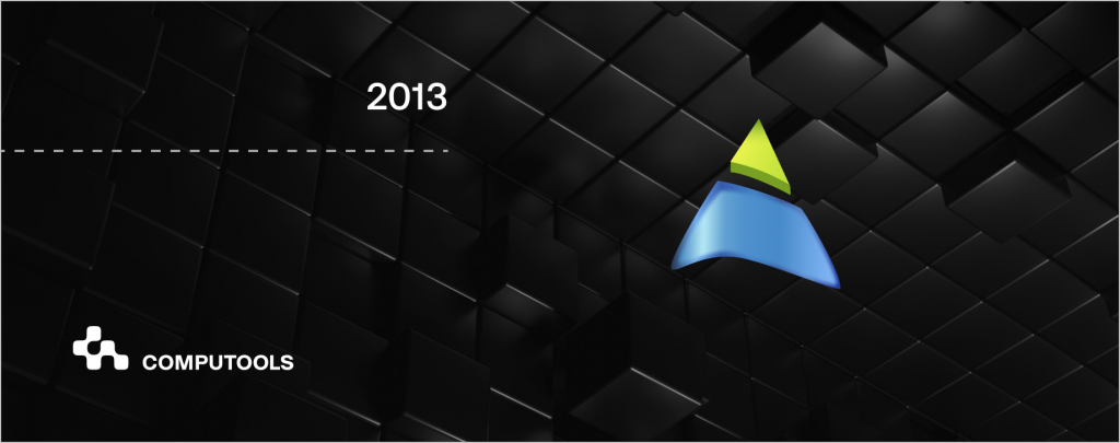
In 2013, Sergii Tymchuk, Grigoriy Shadara, Oleg Svet, and Viktoria Stepanova declared Computools a company specialising in IT software development services. At this time, a logo was created to communicate the young company’s plans.
Our logo was a stylised arrow pointing upwards. The arrow symbolised the desire for achievement and growth, reflecting the ambition during our initial period of existence. The colour palette included elements of blue and lettuce. Blue is associated with technological solutions, stability, professionalism, and trust. This colour underlined our reliability and competence in providing technological solutions.
The colour lettuce symbolises innovation, growth, energy and prospects. It reflected our commitment to sustainability and the introduction of new technologies.
For clients, it embodied reliability and a willingness to offer innovative solutions. For employees, it signified their involvement in creating something meaningful.
Our first logo reflected the initial stages of our software development company and our confident aspiration to be a leader in IT services.
Logo 2014-2016 Evolution
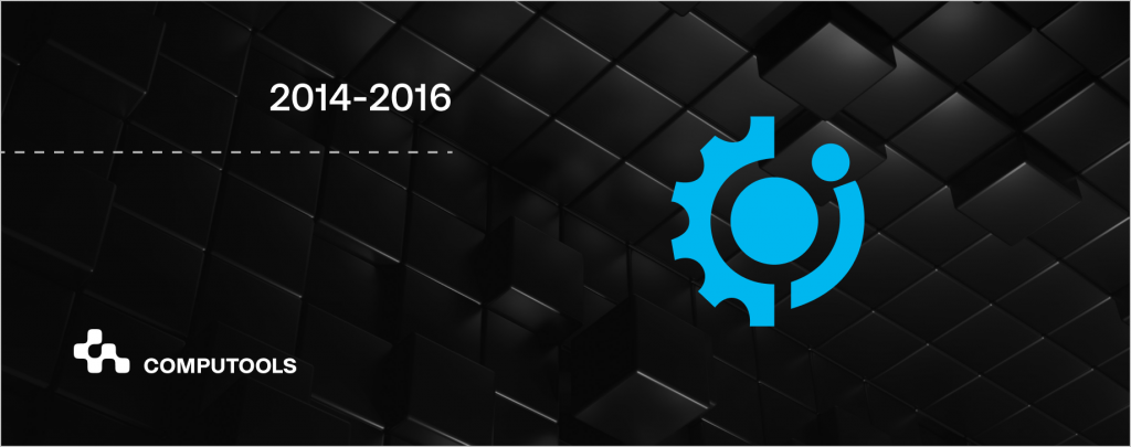
Between 2014 and 2016, we strengthened our position in the market by expanding our workforce. We started working with a broader range of technologies, collaborated with start-ups, and began to grow new offices in North America and Europe. We decided to revamp our logo to reflect our professional and accurate work.
The new Computools logo combined two symbols: a gear and the letter “i”. The gear was a symbol of coherence, precision and working like clockwork, emphasising our ability to integrate effectively into digital processes. The letter “i” stood for information technology, which clearly defined our specialisation.
We changed the logo’s colour to sky blue. In digital technology design, sky blue is often associated with innovation, technological development, and reliability. This tone added to our unique and modern look.
Our new logo conveyed the message to clients and partners that we operate like a Swiss watch in the digital technology industry. It symbolised the company’s precision, professionalism and reliability in executing technology projects. For employees, the logo spoke of stability and synergy in the team, which helped them feel part of our successful and technologically advanced organisation.
This second logo reflected our new phase of development, showing our evolution in the IT industry and our commitment to high standards of professionalism and innovation.
Logo 2017-2018 International Recognition
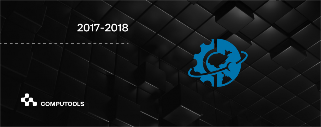
Between 2017 and 2018, we cemented relationships with major clients such as Dior, Epson, Bombardier, and Caribbean Bank and significantly increased our workforce. This period was pivotal for our company as we entered a new level of development.
The new logo included an image of a planet, symbolising Computools’ global presence and scale of operations. The integration of the Earth also reflects the company’s international orientation and our ability to provide a world-class service.
We changed the logo’s colour to a darker shade of blue, which is associated with reliability, stability, and professionalism. This choice of colour added to our seriousness and made the visual perception of the company more solid and authoritative.
The new Computools logo communicated to customers the global ambitions of Computools and our ability to provide high-quality IT services worldwide. For employees, it symbolised an international team and unity in achieving common goals. The logo emphasises that Computools is globally positioned and ready to provide advanced technology solutions worldwide.
Logo 2019-2020 Transparent Cooperation
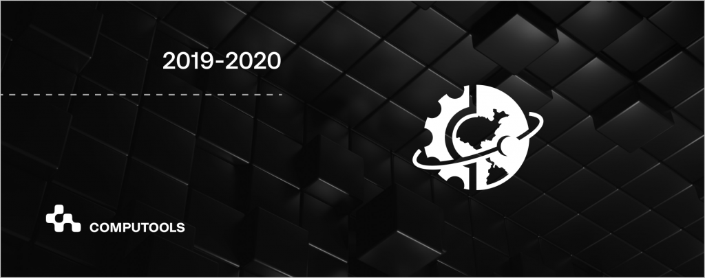
Between 2019 and 2020, our management decided to change our logo. The new logo left the company symbols, however the main change was the colour of the logo which became white on a black background.
The colour change showed the visual identity’s desire for minimalism, modernity, and elegance. The black background with white symbols creates a strong contrast, making the logo more visible and easily read. This design is associated with our services’ premium and high quality, which is vital for a company in the high-tech segment.
Logo 2021 Present Day
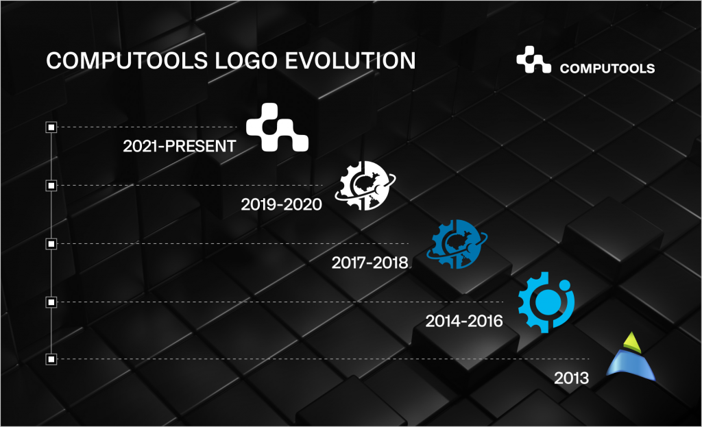
From 2021 to the present day, we have been actively expanding and consolidating our position in the international IT services market. Our company launched a new IT cluster and offices in Kyiv, New York, London, Berlin, Tel Aviv, and Tokyo. We also acquired other companies that allowed us to expand our competencies. With a focus on 18 main industries, we aim to compete with giants like SoftServe, Epam, and GlobalLogic.
The construction of the new logo is inspired by the arrangement of the arrow keys and the letters “C” and “T” on a keyboard. The arrows symbolise our ability to drive and manage business processes, while the letters “C” and “T” stand for the company’s name.
Together, they form a cross, emphasising the “Swiss-like” precision and reliability. The design system is built on modular grids and blocks, with layouts highlighting the engineering accuracy synonymous with Computools’ products.
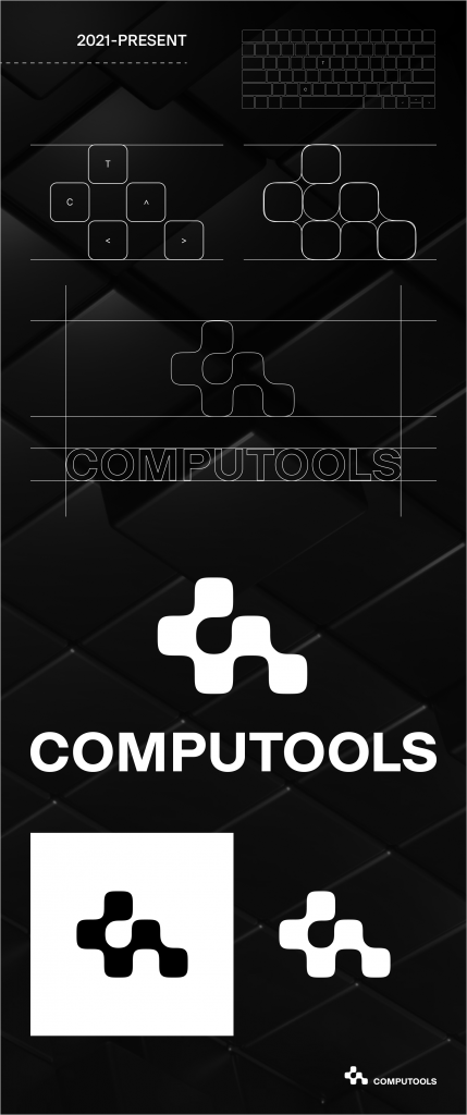
For our clients, it is a symbol of guaranteed business software solutions; for employees, it is the promise of working for a company where every detail counts and where systematicity and precision are respected.
“Unlock tomorrow” is a communication slogan and a global meta of Computools, because Computools’ products and services bring the future closer, shape it and open up new possibilities.
Thus, the new Computools logo reflects our philosophy and values and emphasises our global ambitions and commitment to leadership in information technology.
Conclusion
Every change our logo has undergone has been for clear communication. We do everything with our client in mind and strive to be as clear, transparent, and accessible as possible to understand and collaborate with.
Our logo has evolved with us, reflecting our achievements and vision for the future, symbolising our commitment to innovation and quality in IT services.
If you’d like to learn more about Computools’ journey and how we can help elevate your business, please reach out to us at info@computools.com.
Computools
Software Solutions
Computools is an IT consulting and software development company that delivers innovative solutions to help businesses unlock tomorrow.


“Computools was selected through an RFP process. They were shortlisted and selected from between 5 other suppliers. Computools has worked thoroughly and timely to solve all security issues and launch as agreed. Their expertise is impressive.”